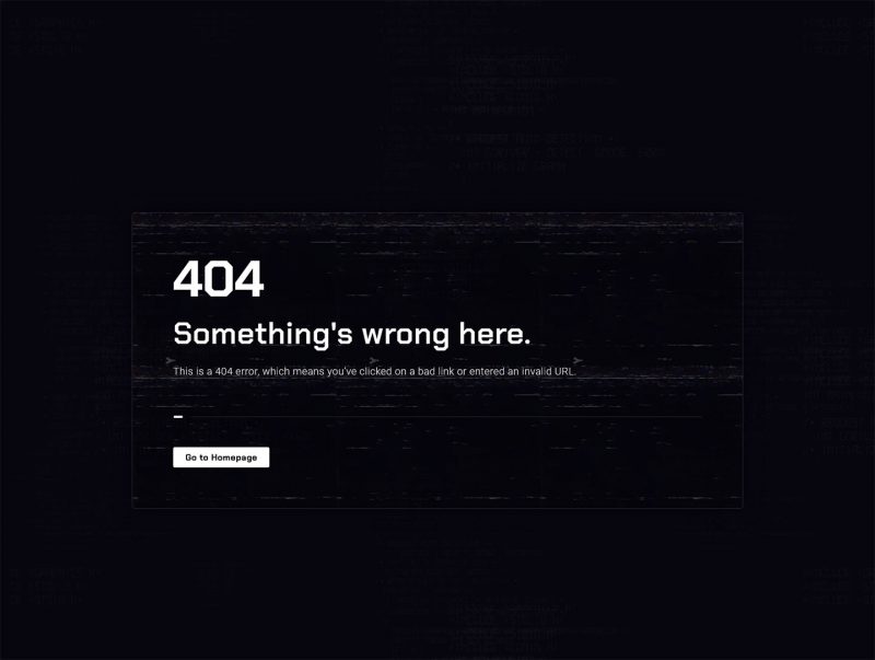
Crafting a 404 error page requires a thoughtful approach to ensure it’s not only visually appealing but also user-friendly. Here’s a refined take on your content:
Streamline Your Message: A 404 page should be straightforward and easy to navigate. Keep the text brief and to the point to accommodate quick scanning by users.
Personalize Your Approach: Steer clear of one-size-fits-all messages. Tailor the content to echo your brand’s unique voice and connect with your audience on a more personal level.
Ensure Design Cohesion: Your 404 page should be a seamless extension of your website’s overall aesthetic. Consistency in design and navigation aids in maintaining a cohesive user experience.
Enhance Functionality: Transform your 404 page into a helpful stopover by incorporating essential links or a search feature, guiding users back to useful content.
Select Imagery with Purpose: Choose images that resonate with your message and enhance the user’s experience. The right visual can speak volumes without overwhelming the page.
Embrace Negative Space: A clean layout with ample whitespace can make your 404 page feel less crowded and more inviting.
Showcase Your Brand’s Character: Use this unexpected encounter to leave a lasting impression of your brand’s character, turning a potential frustration into a memorable moment.
Remember, the objective is to create a 404 page that not only addresses the error but also provides a positive experience that reflects your brand’s ethos.